Jack's

Reviving Jack Astor's rebellious spirit for a new generation of diners

Jack Astor's had grown tired. The rebellious energy that once defined the brand had faded, and guests — especially younger diners — no longer felt it.

I led the rebrand to bring that spirit back, redesigning the experience with a bold visual identity and a lively voice that spoke directly to Gen Z, while still respecting long-time regulars.
My Role
Lead DesignerBrand Design, Experiential Design, UI/UX
Impact
+47%Growth in first-time Gen Z visits
93%Positive guest sentiment after launch
20%Revenue uplift in renovated locations
Scope
Brand Strategy · Visual Identity · Experiential Design · UI/UX
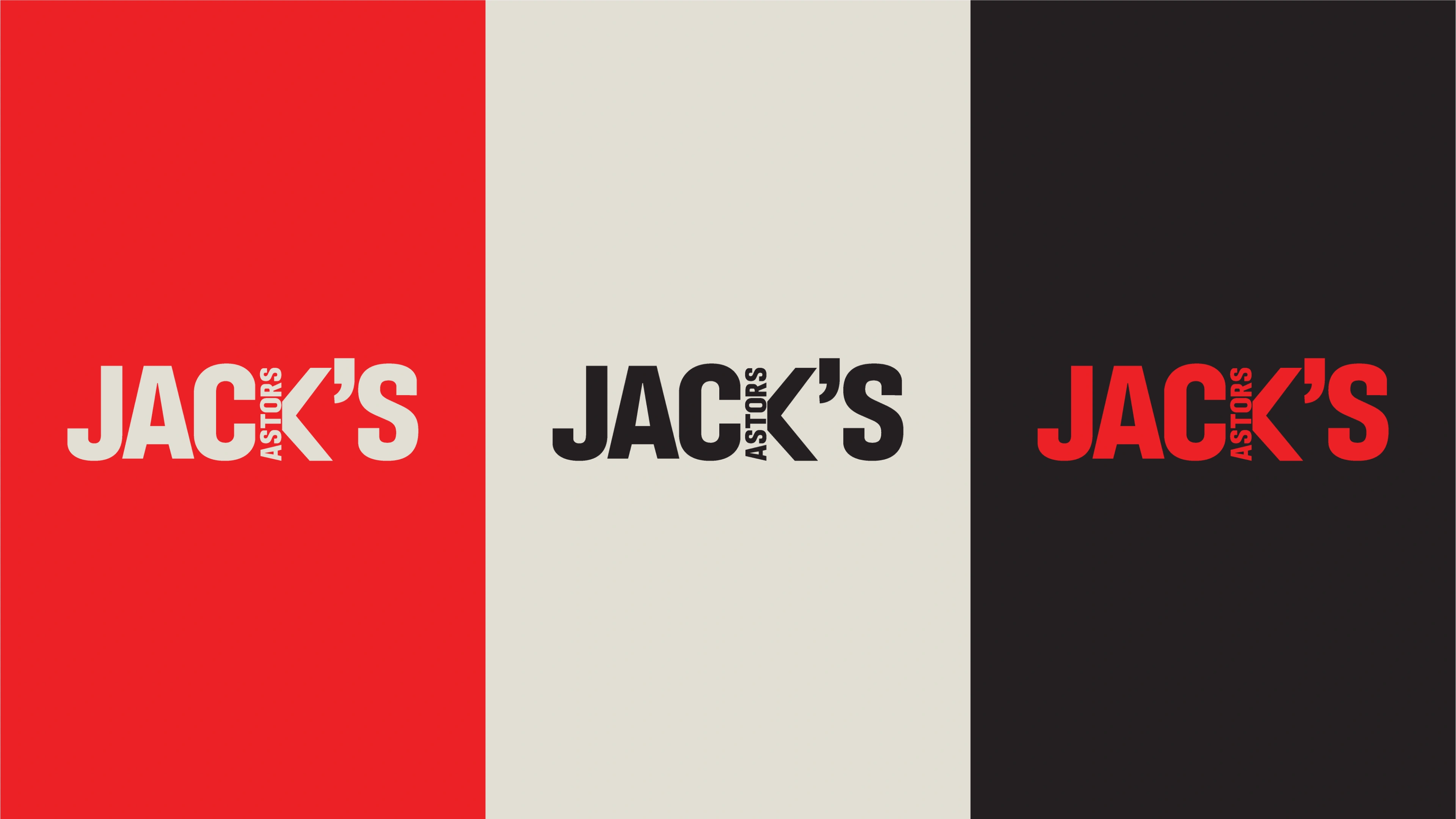
The Jack's logo shown in three lockups — red on cream, black on cream, and red on black — each paired with the 'Live Free and Eat' tagline
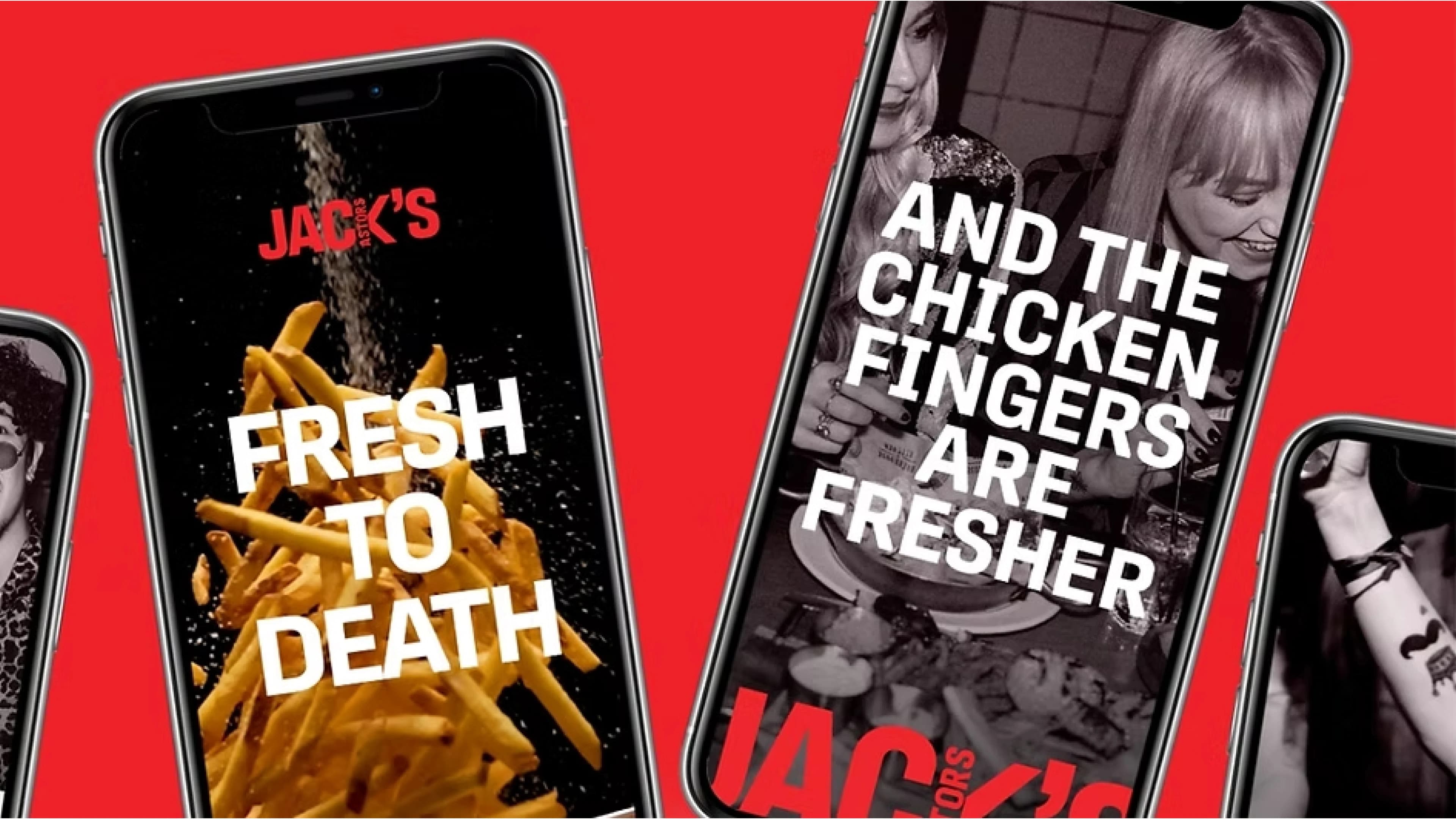
Mobile ad creative for Jack's — 'Fresh to death' over a pile of fries, and 'And the chicken fingers are fresher' over a table of food and drinks
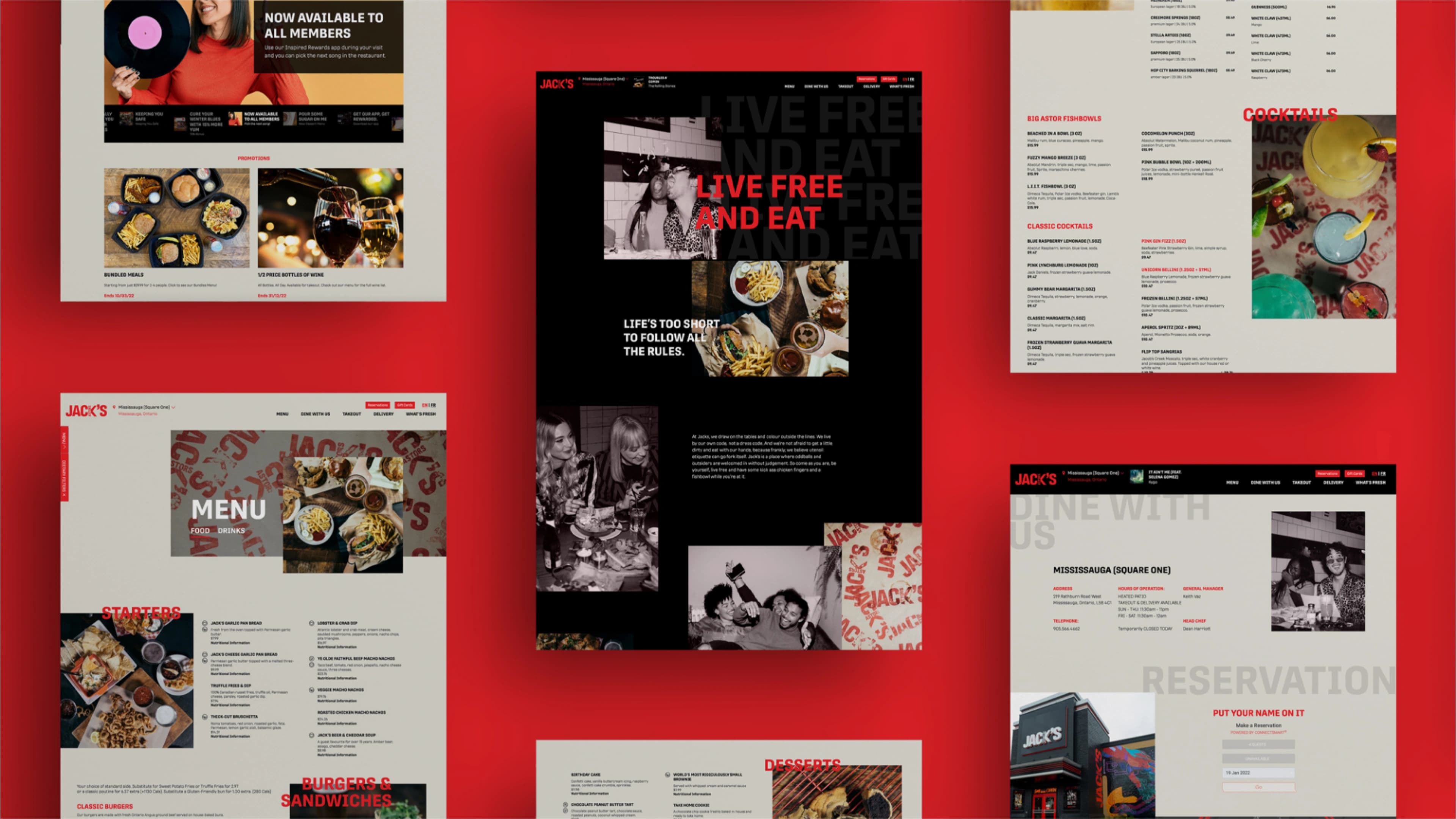
The redesigned Jack's website — a dark homepage hero reading 'Live Free and Eat' beside a light menu page listing food and drinks
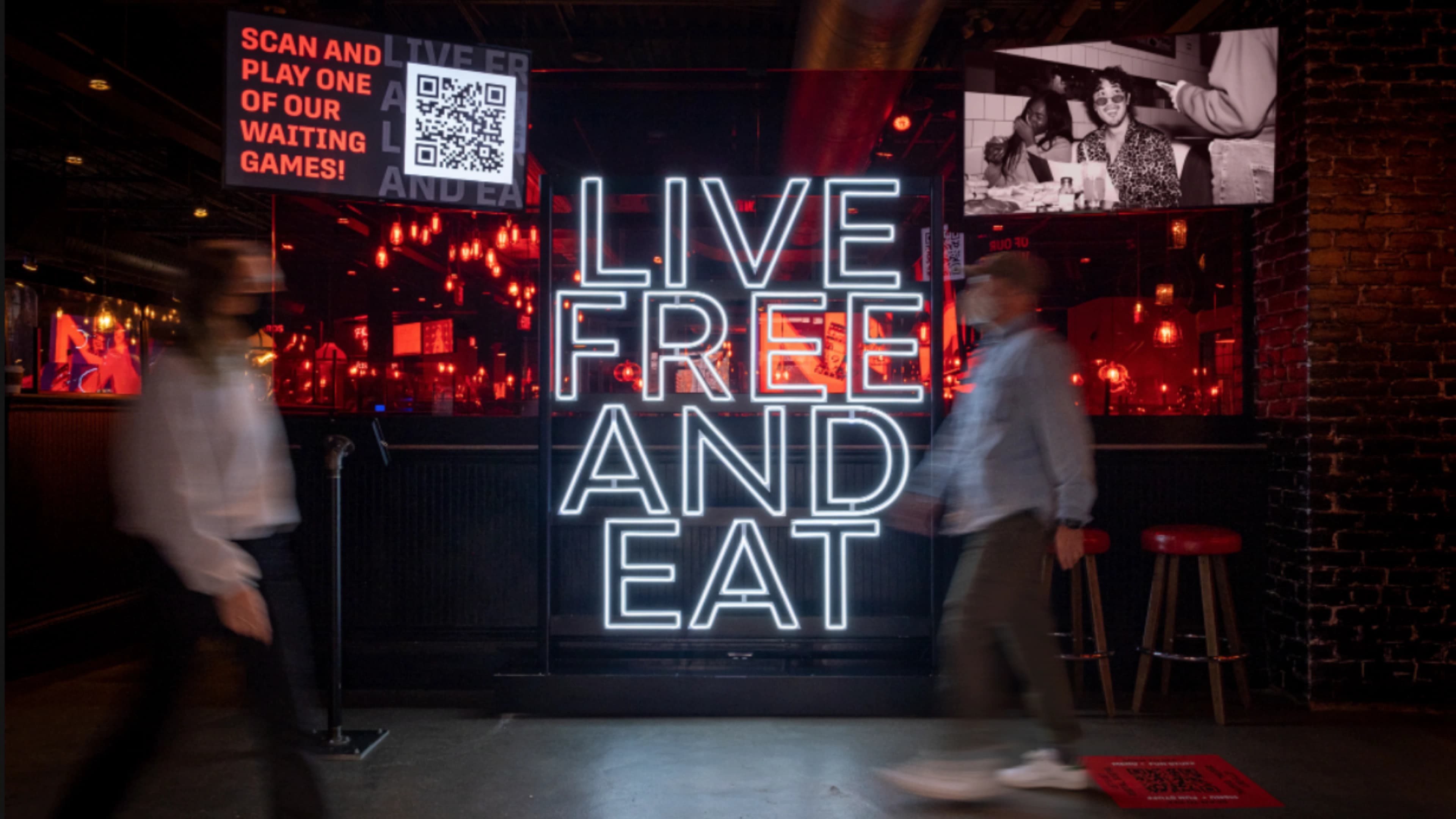
An in-restaurant 'Live Free and Eat' neon sign flanked by a QR-code waiting-game prompt and a photo wall, with guests walking past